|
|
|

|
| IMAGE SEARCH | FOLDER SEARCH | NEW IMAGES | LOGIN | INFO AND HELP | PRICES A ND TERMS | NEWS | PRINT SHOP | ART SHOP | IN FINNISH |
|
|
|
|
| IMAGE SEARCH | FOLDER SEARCH | NEW IMAGES | LOGIN | INFO AND HELP | PRICES A ND TERMS | NEWS | PRINT SHOP | ART SHOP | IN FINNISH |
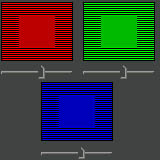
Clicking this image above opens a new window with the image tiled so that
you can
check the full area of your monitor.
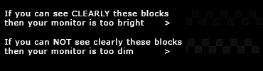
Squint your eyes until you
do not see the line screen in
the picture. If you then
cannot recognize the squares
in the middle your monitor is
well adjusted for colors.
Simple monitor adjusting procedure.
Our pictures are best viewed on a calibrated monitor.
Those working in the
graphic and reproduction professions are used to working with calibrated
systems set up by their own departments. If you are in that kind of
working
environment then this page is not relevant to your needs.
We recommend, as does Adobe, that the Gamma
for your PC monitor should be set at 2.2 - also on a Mac.
1.
Adjust your working space lighting so that it won't
change significantly
throughout the day. Better to have a consistently lit room where strong
light and shadows don't interfere with the eyes or the monitor. Neutral
grays are best as strong colours can reflect unwanted colour into your
viewing environment. Image handling will result in headaches and worthless
pictures if the eyes and brain are forced to adjust to the lighting
in a
poor environment.
2.
Set the monitor colour temperature to 6500°
Kelvin. This adjustment can be
made in the settings of most contemporary monitors whether they be CRT
or
TFT though it might be hard at first to find through the menu. 6500°
is the
correct temperature if your desktop lighting is standard flourescent
tube or
industrial lighting of 5000° used in the graphics industry.
If your desktop lighting is only halogen or tungsten
at 2800° - 3200° then
you should set the monitor temperature to 5000° Kelvin. This is
used
primarily in photographic studios and TV monitoring rooms where there
is no
natural light coming into the room.
3.
Next set the monitor 'Gain' or 'Contrast'
settings to 100%. This is not a
true 'contrast' device as the name suggests but is more about governing
the
amount of light the monitor displays.
New TFT monitors can sometimes be too bright in
which case it is better to
turn the contrast down slightly to account for this.
4.
This procedure may NOT work well with iPad
5.
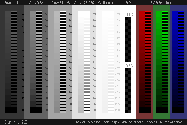
Next set your monitor Brightness so that the Black Point (B-P on the image above) just barely shows the differences between the two shades of black in the 0.8% column and just barely shows the difference in the 0.4%. (You would have to look very hard to see the difference at all in the 0.4% column.)
In each of the other columns (all grey levels and RGB brightness) you should be unable to see any differences in the shades or colours of each pair of lines when squinting from a reasonable distance back. The Gamma image has both flat colour and lines designed to produce an even tone when the monitor is set up correctly.
6.
It might be a good idea at this point to tape the adjustment console of your monitor closed to stop any changes being made by 'well-meaning' individuals who don't really know what they are doing! If you are lucky enough to have a new monitor then you might find the option to be able to lock the settings.
7.
If you use Adobe-Gamma in a PC or Apple ColorSync Monitor calibration in a Mac it is much better to use the above Gamma image to make your adjustments. You can open the image and reference it while you are running the program and check it against the changes you make to get the very best out of monitor calibration.
It is imperative to remember that after you have changed your monitor settings using the adjustment panel on the monitor you should then rely on the Adobe-Gamma in a PC or Apple ColorSync Monitor calibration in a Mac to make any further adjustments.
8.
Most picture editing and graphic applications now include comprehensive colour management dialogue boxes to assist you in creating the best working environment for your needs.
9.
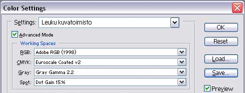
All our downloadable high resolution pictures in Leuku use Adobe RGB colour space and therefore we would highly recomment our clients to do the same. This will ensure consistency in workflow.
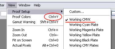
Remember if your project is destined for print, occassionally preview the image using the Working CMYK setting as indicated in the image below as a way to soft proof the result onscreen.
Remember if you save any of the preview images to your hard drives for compositing purposes that these are in sRGB colour space and will give a different result.
Please NOTE: Monitor calibration is not so easy as it might first seem. Professional calibration hardware devices will almost always produce a better result.